


FEED ZONE is for the scroll. Kit, objects, rare finds, and things worth stopping for. On the bike and off it. In and out.
You can follow us on Instagram here, but in its purest and most beautiful form this is a newsletter, something to slow your timeline down

BEFORE WE START
GRAVITYHILL is free to read and always will be. But if you are getting something out of it, a subscription goes a long way toward keeping this independent.
In case you missed it, here is what we have been working on:
LEFT TURNS // 004 — WHO MADE THAT KIT
Every WorldTour and ProTeam kit supplier for 2026. Men and women. In one place.
MOODY BOARDS // 005 — GIRO D’ITALIA
No explanation. No context. Just the feeling.
BREAKAWAY // 006 — La Corsa Rosa
The Giro started in Bulgaria and ends in Rome. In between, twenty-one stages, the Blockhaus, the Dolomites, and a hundred and fifteen years of history. Our love letter to the most beautiful race in the world.
If that sounds like your kind of newsletter, you know what to do.
We do not use affiliate links. We do not get paid to feature anything. No sponsored placements, no brand arrangements, no performance fees. Just things we actually rate. For the love of the game.
THE HELMET EDIT
Most helmets these days kind of look the same. Same elongated tail. Same six vents in the same six places. Same white colourway on the brand website shot from the same angle. The aero road helmet category has been converging on a shared aesthetic for some time now. Not that it’s always a bad thing, but wind tunnels point everyone toward the same similar solutions. Cycling marketing wording leads everyone towards the same path. But there is still a difference between a helmet that was designed to pass the safety test, one that was made to “save” you some watts, and one that was designed to hold your attention and look good on your noggin’.
We are not rating safety here. Every helmet on this list meets the minimum standards required to sell in its market and most have been independently tested by Virginia Tech. We are not going to pretend we have done the crash tests. What we can tell you though is how they look, what the details are doing, and whether they are worth the money.
We have not ridden in all of these, and we are not going to pretend we did. Every helmet on this list is on here because we think they visually look great.
Now, before we get into all this, there are a few “rules” we have about colour. Here at GH, we are very much a white everything type of aesthetic. Not because of Instagram, not cause of some cycling influencer. It has just always been that way. White shoes on and off the bike, white tees, white jerseys. White. When it comes to helmets, we have also always loved white, but we do believe that playing with colour here is cooler. The move going forward might not be the white helmet but a helmet colour that matches your bike, or your team jersey, or the kit colour you wear most often. There is some leeway to break the white rule when it comes to helmets.
Also, sizing matters. As much as we love a good deal online, try to walk into a store and try them on. If you do find a deal online, ask your local store to price match. Most of them do it. A helmet should not move on your head. It should be snug. We have bought too many helmets that needed to be clinched super tight just to stay put. Do not do that.
We did not include any helmets from Specialized, Trek, Giant, and similar other bike brands. We believe that to wear a helmet from those brands, you should ride their bikes. Do not ask us why. It is just how we feel.
Here are the helmets we are loving right now, in no particular order.
MET Trenta 3K Carbon MIPS
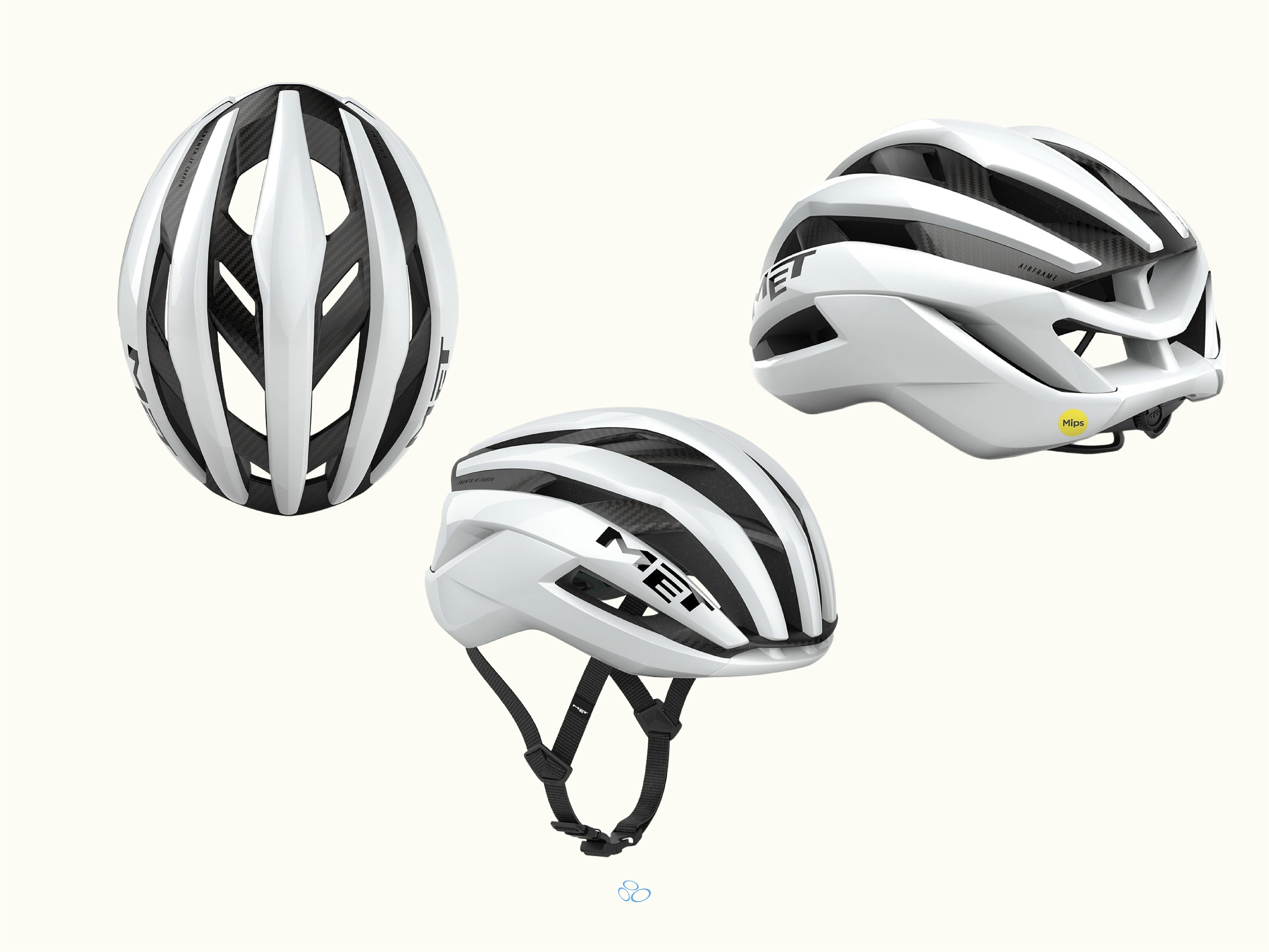
Honestly, this is one of those products where the sponsorship scheme worked. It is the helmet Tadej Pogacar wore to win the 2024 Tour de France and the Giro d’Italia. Seeing him ride in it gives the helmet some major aura points. That’s just the truth. The Trenta sits slim on the head, lower profile than most in this category, which is the detail that makes it photograph well and look right on the bike at the same time. The Pogacar colourway, a purple fade, is one of the better colourways that MET released for this product. This is probably the better helmet if you have a slimmer face. Four total colourways to choose from. Its probably also the most ventilated helmet out of the bunch.
Honourable mention to the Portal and KXNGS collab versions for anyone who wants the same helmet in something rarely anyone else is wearing. Two of the more interesting brand collabs in cycling kit right now. These are definitely the ones to purchase if you can get your hands on them.
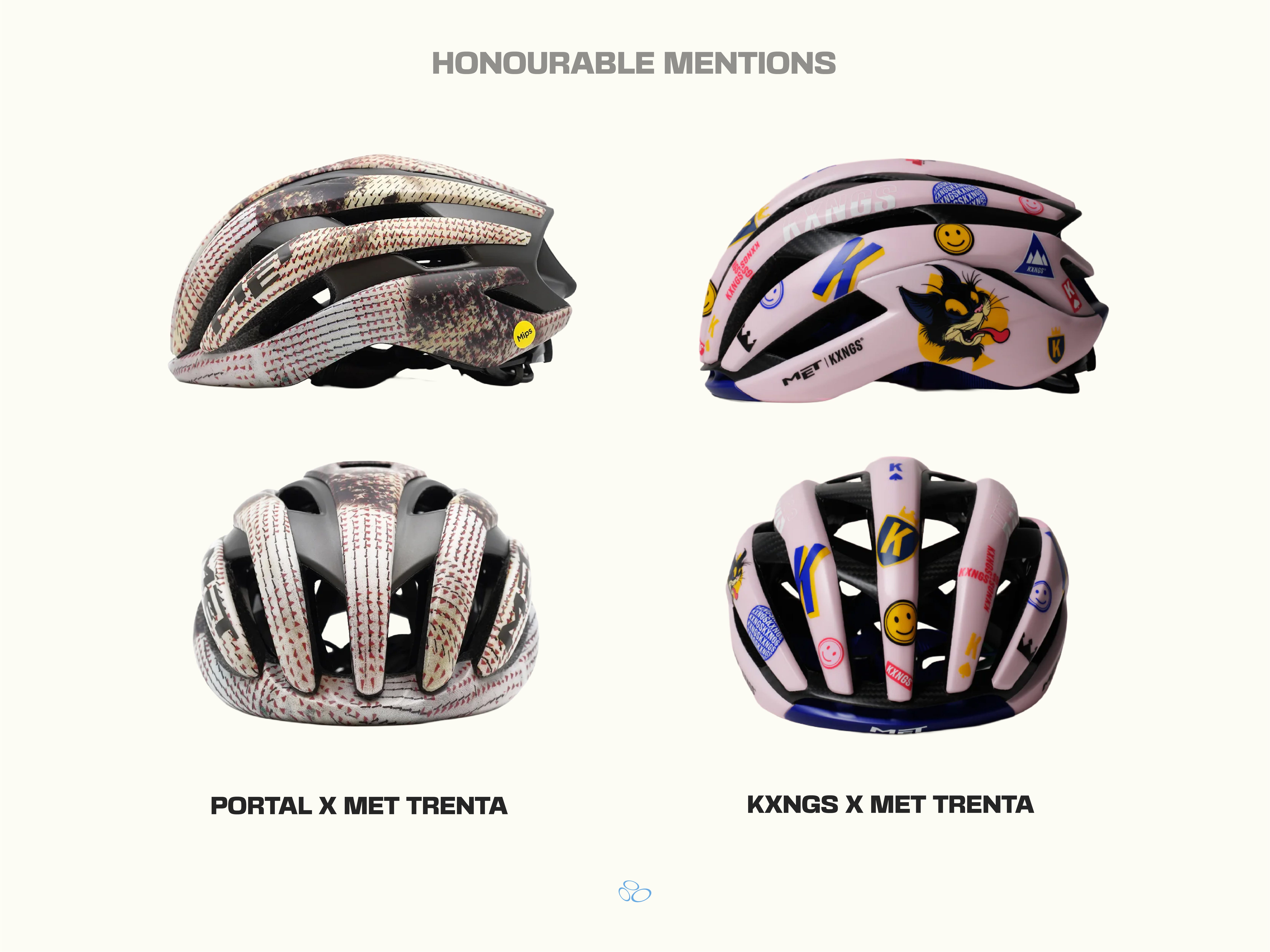
Find the Portal x MET collab, here.
Find the KXNGS x MET collab, here.
Find the MET Trenta, here.
KASK Utopia Y
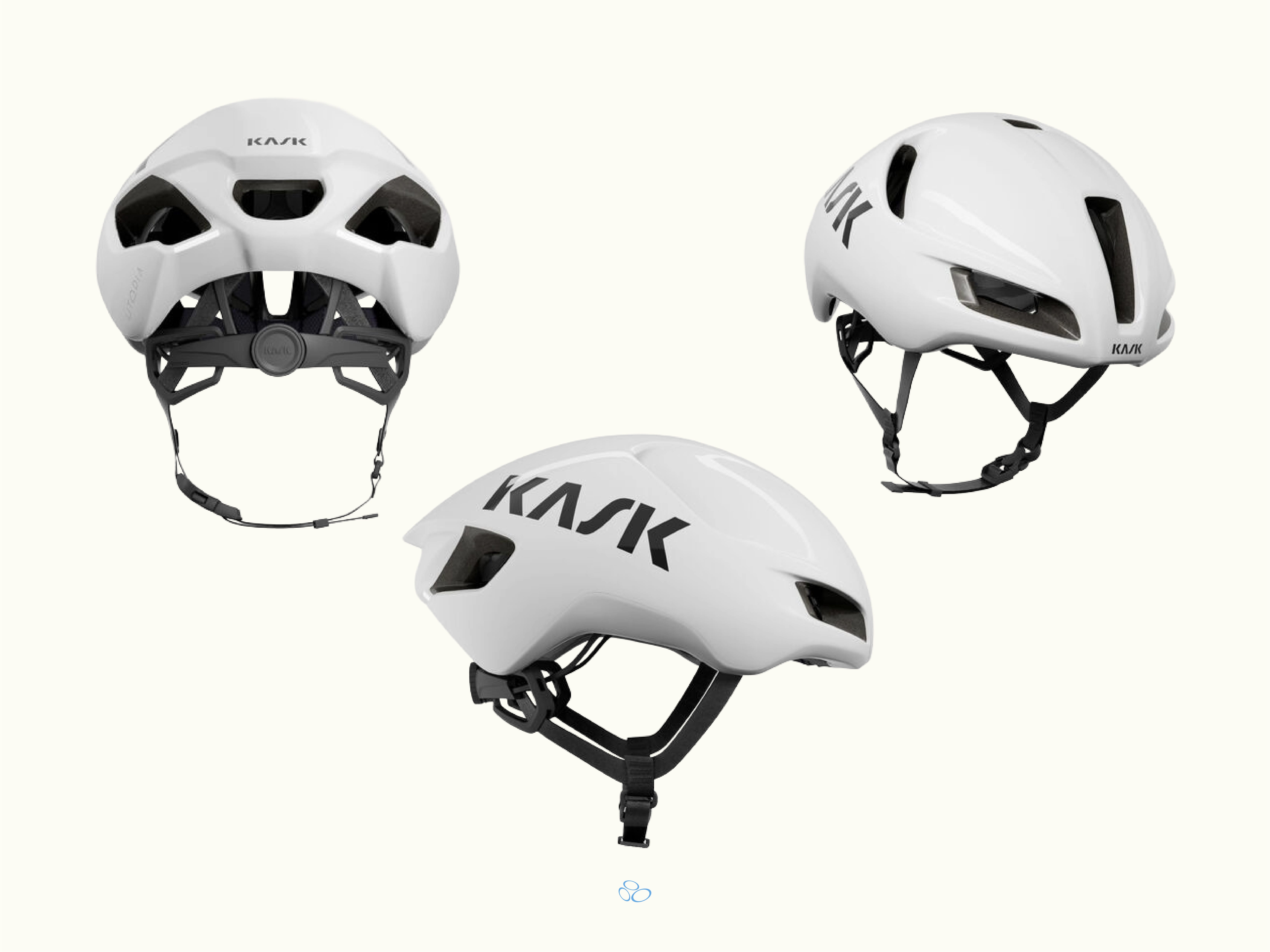
Italian brand… so of course they added some flair. The faux leather chin strap sounds like a detail that shouldn’t matter and somehow we kind of dig it. Nobody else in the category does it. The Utopia Y sits close to the head, closer than the profile suggests it should, which makes it look considered rather than bulky. Elongated at the rear, clean at the front, “minimal” logo placement. Eleven colourways, which is more range than most helmets in this category. Printed logos rather than stickers, which doesn’t sound like much but does really make a difference.
Honourable mention to the Paul Smith collaboration. These are genuinely the better colourways. Candy stripe. Marble. Its the kind of design that makes someone ask where you got your helmet, and we all know we love getting asked those types of questions... If you are going to spend this much on a helmet, spend it on a Paul Smith one.
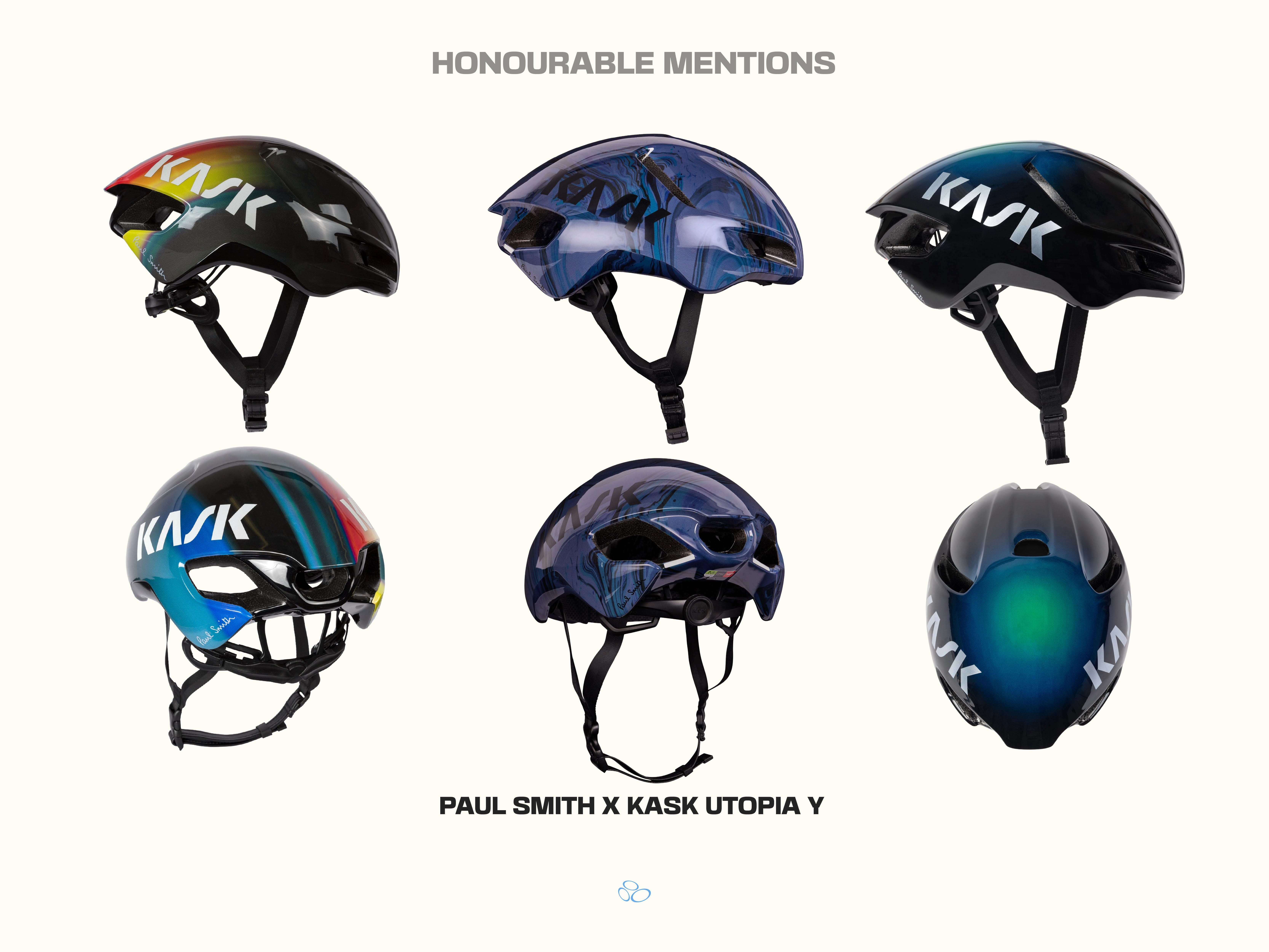
Find the Kask x Paul Smith collab, here.
Find the Kask Utopia Y, here.
MET Manta MIPS
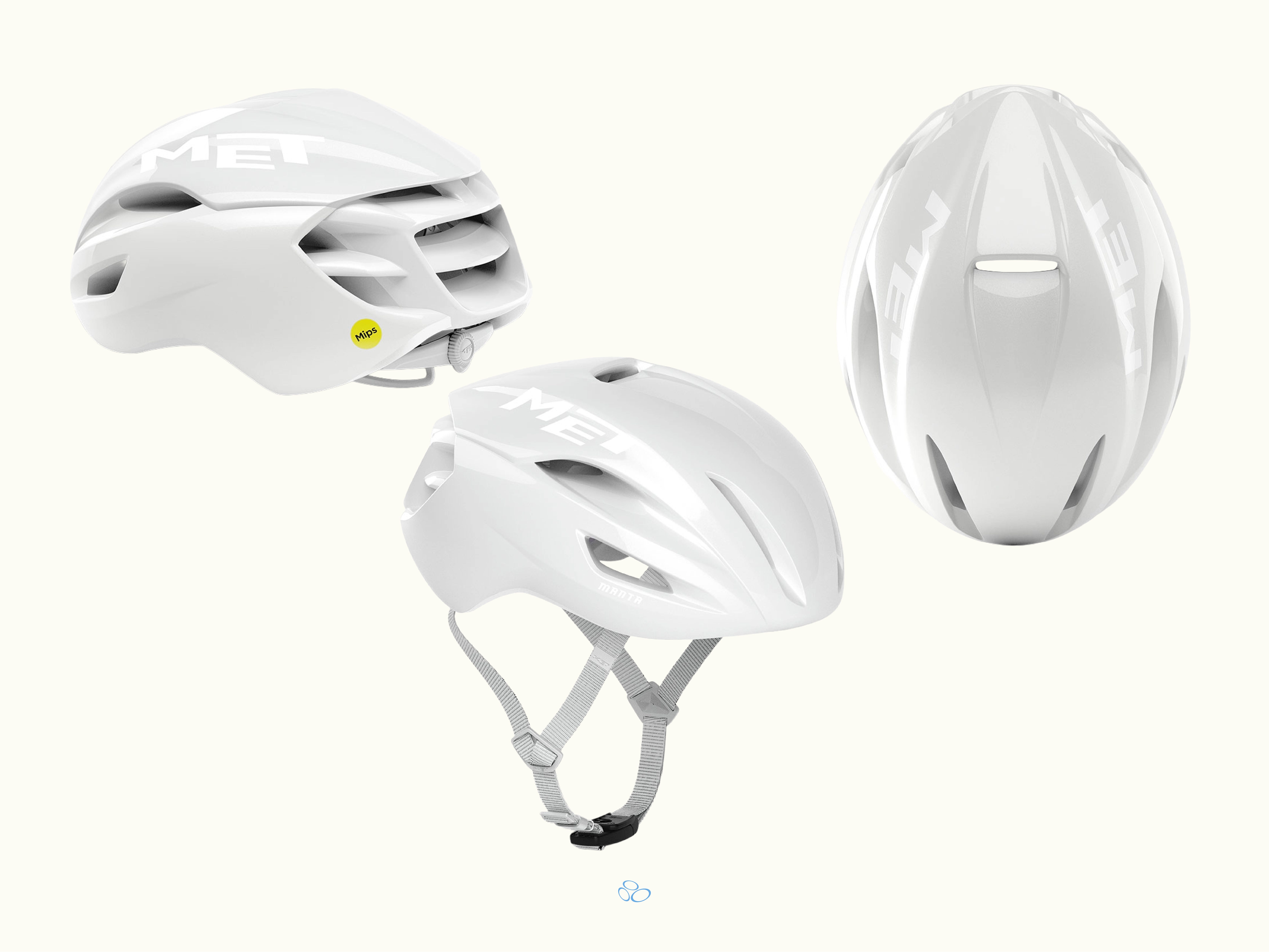
The Manta has been around since 2015. Mark Cavendish debuted it. It has been redesigned twice since, and the current version is the best-looking iteration by some distance. Lower profile than most, tube-shaped at the rear, sits small on the head so it wont give you that mushroom look. Fidlock magnetic buckle on the strap, which is the best buckle in the game and the most underrated detail in cycling kit. This is the kind of helmet that looks like it costs more than it does, which at this price point is a massive compliment.
Honourable mention to the Tan Line version of this helmet. Mainly off-white, but with a subtle pattern inspired by Marés, the distinctive sandstone found on Mallorca. The pattern gives the helmet a cool freshness.
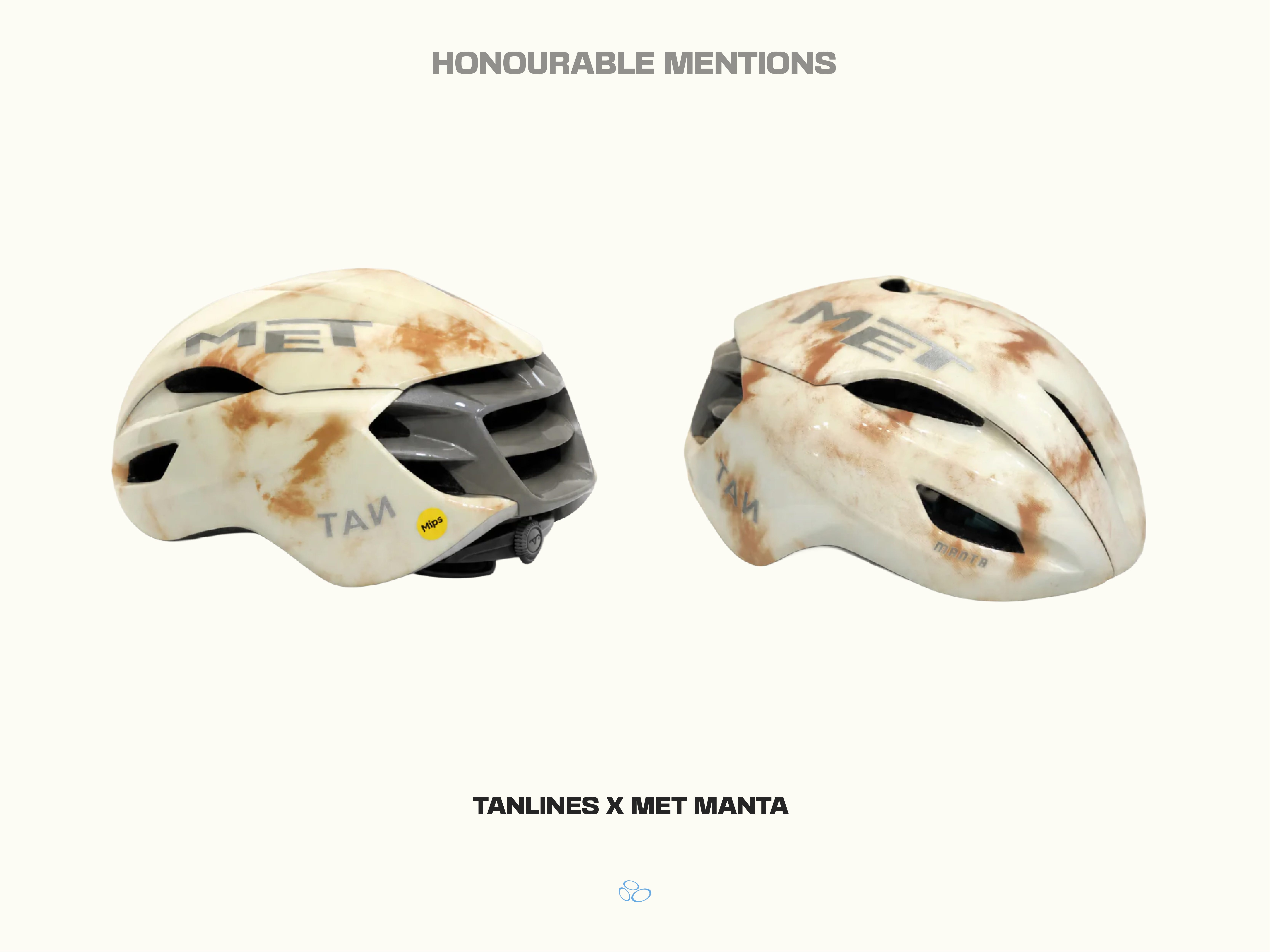
Find the MET x Tan Line Manta, here.
Find the MET Manta MIPS, here.
Abus GameChanger 2.0
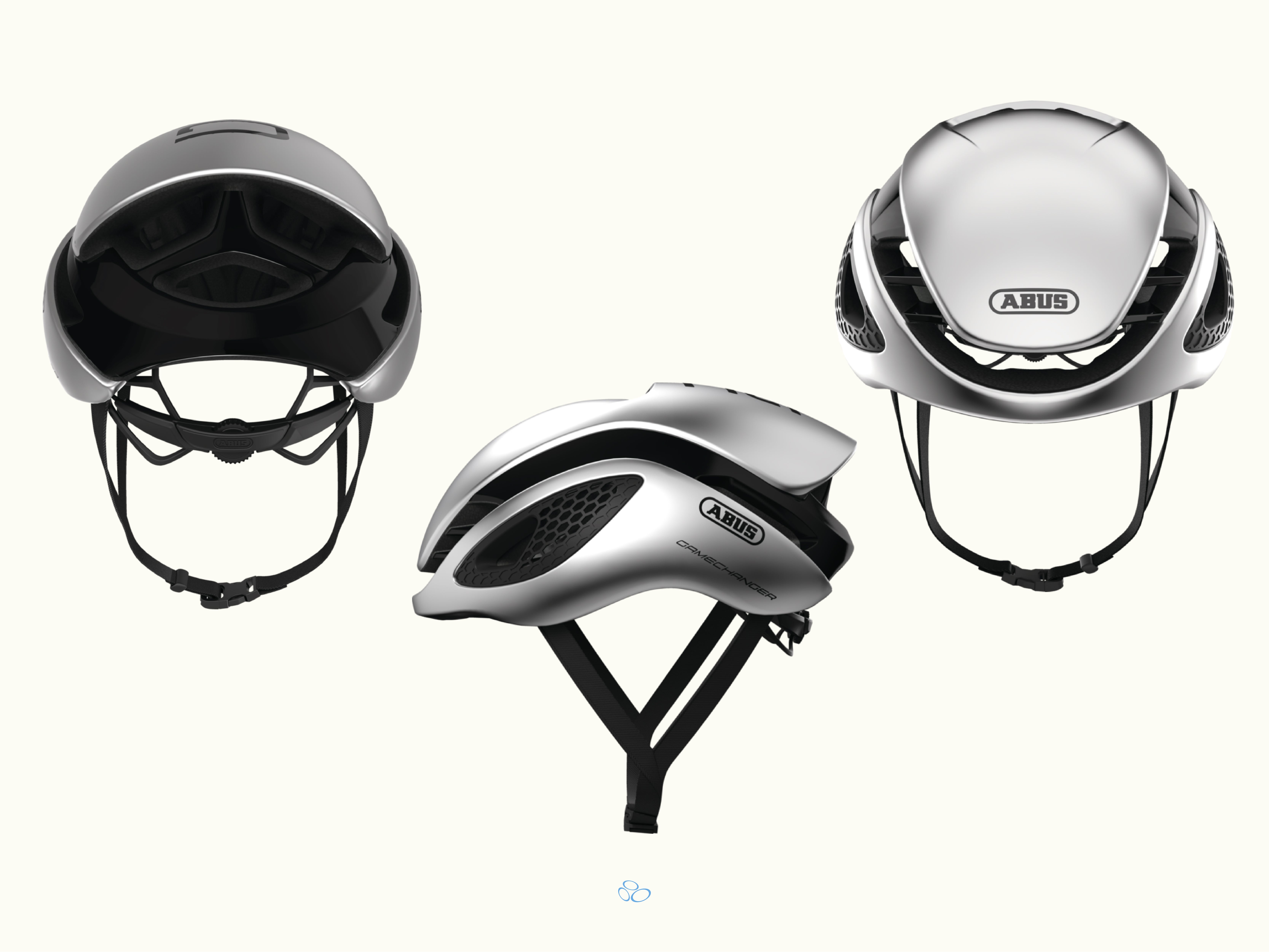
Mathieu van der Poel races the original GameChanger, so the updated version definitely makes the list. His is Canyon branded though, but it’s the same helmet. Most of the peloton moved to the 2.0. Yet he didn’t. That says something about how well the original was built and how hard it is to improve on something that already works. The 2.0 is wider at the rear than its predecessor, which gives it a slightly more aggressive silhouette. The shark fin bridges across the top is the most visually distinctive detail on this helmet. It comes in 18 different colourways so you got some choice with this one.
Find the Abus GameChanger 2.0, here.
Sweet Protection Falconer Aero 2Vi MIPS
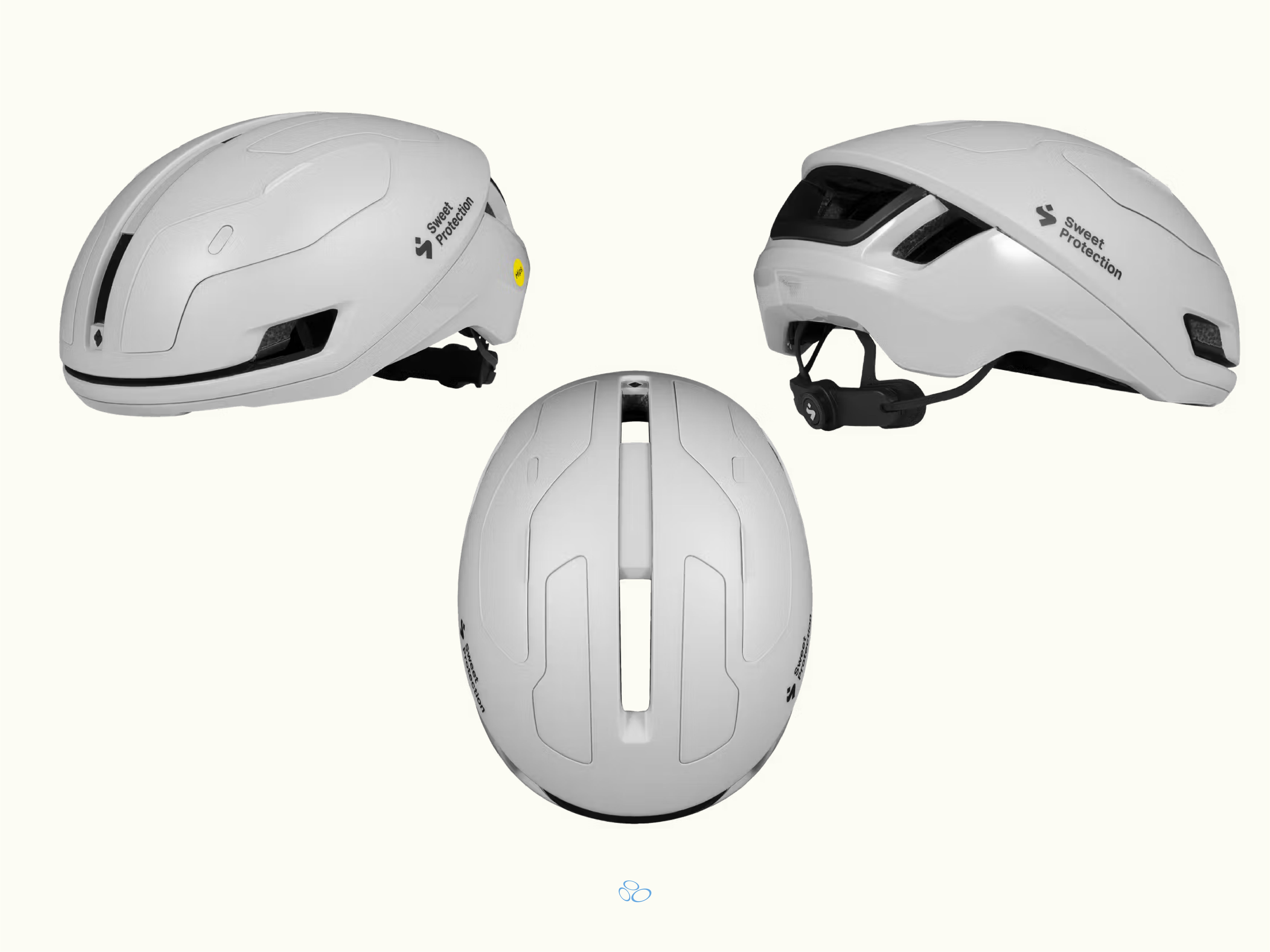
Norwegian brand. Twenty-five years making head protection for snow and paddle sports before they came to road cycling. That history really does show up in how seriously the construction is taken rather than just how it is marketed. The Falconer Aero sits low, smooth shell, subtle vent placement that doesn’t break up the profile. Seen it in person multiple times and it looks great. The aero version has magnetic vent covers which add a panel detail that is worth the extra spend. The smoke grey colourway is one of the better helmet colours available right now.
Honourable mention to the PAS Normal collaboration. The Ion Grey, which is technically more purple then grey , is the cooler colour option for this helmet (if you can match it to something). Sweet Protection is truly underrated.
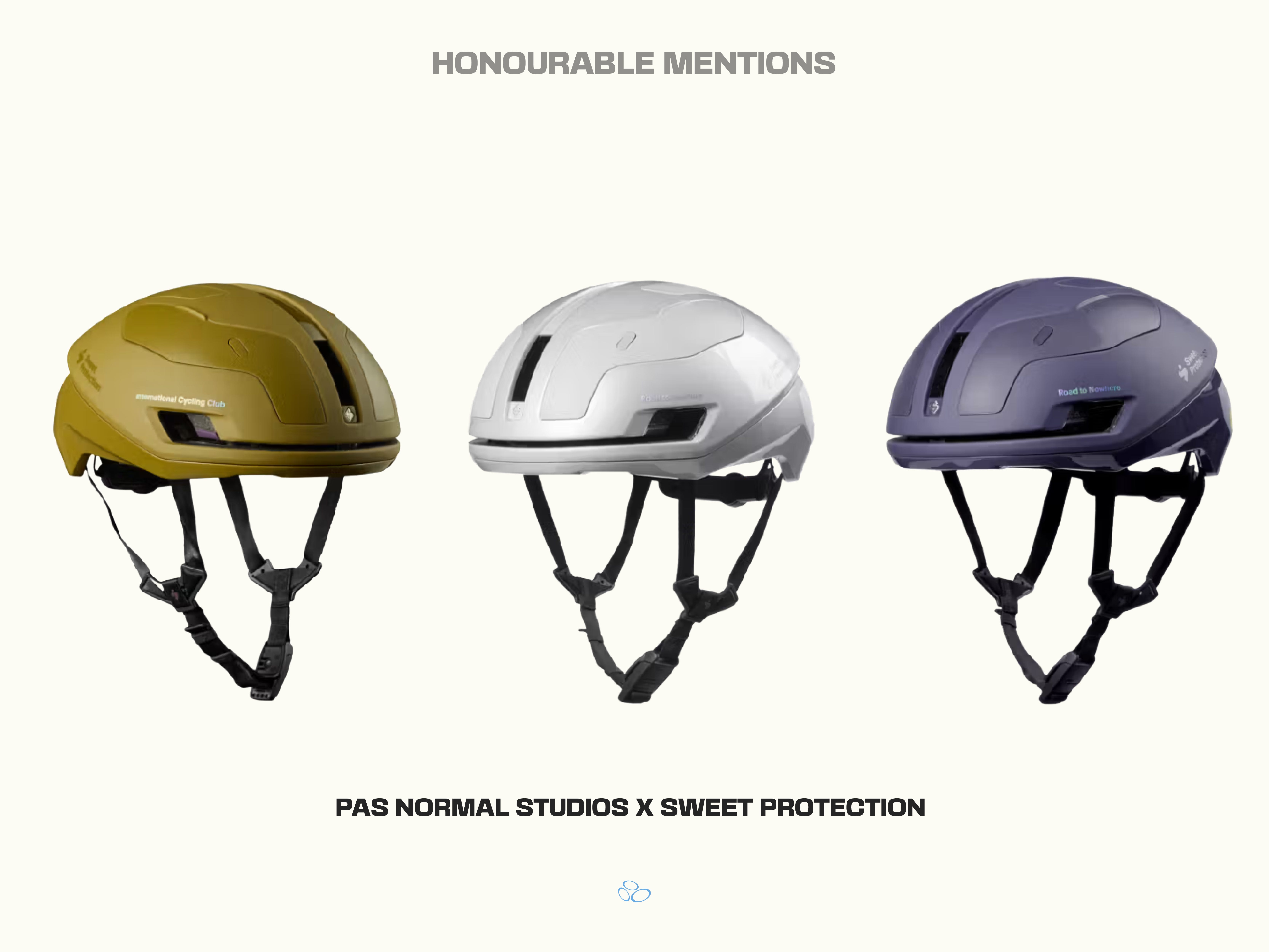
Find the PNS x Sweet Protection collab, here.
Find the Sweet Protection Falconer Aero 2Vi MIPS, here.
Oakley ARO7
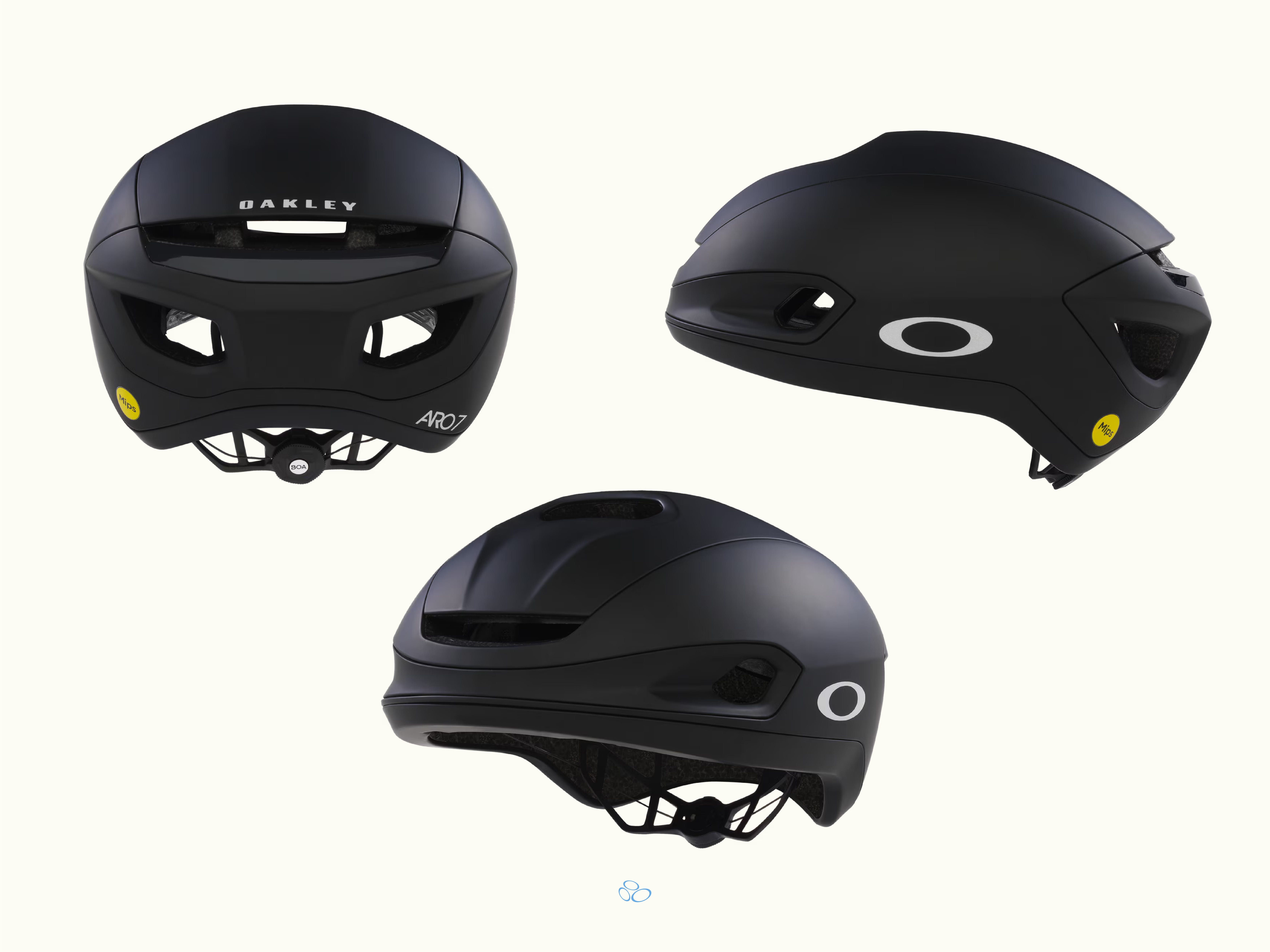
The ARO7 comes in two versions. The Road version has an integrated Prizm lens that attaches magnetically to the front of the helmet and stows on top when not in use. The Lite version is the same shell without the integrated lens (we prefer this one). Same no-tail profile, same BOA 360 fit system, same silhouette. The shell sits lower on the head than most aero helmets, which gives it a different look from every other helmet on this list. Immediately recognisable on the road. If the integrated lens is not your thing, the Lite version gets you the design without the optics. If it is your thing, the Road version is one of the more distinctive helmets in the category. Also, this is the best option if you want a black helmet. Oakley is kind of crap at making other colours.
Find the Oakley ARO7 Lite, here.
Find the Oakley ARO7 Road, here.
P.S. We are directing you to the brand websites to purchase the helmets but dig a little deeper on the net and deals will find their way to you. Feel free to hit us up on the DM if you have any questions.
To submit a find, a brand, or whatever you’re working on, email KMC@GRAVITYHILL.CC. We read everything. Posting is never guaranteed, but curiosity always is.
Let’s go!
I’m not usually a Kask guy but those Paul Smith collabs are spot-on. Plus the matte-pink Rockets helmets are 👌🏻